Sunday, November 11, 2012

Music with Benefits


Here is the product of my music surveys. One type based poster, one image based poster, and one alternatively done.

Musical Instrument Infographic

For my visual communication class we did a infographics project on a chosen topic. My topic was musical instruments, and the benefits of playing them. Here is the survey I used to gather my data.


Musical Instrument Survey

1.    Have ever you played a musical instrument? If so what instrument(s)? Please circle your answer(s)

a.    I have never played a musical instrument
b.    Guitar
c.     Bass
d.    Double bass
e.     Piano
f.      Drums or Percussion
g.    Violin
h.     Viola
i.      Cello
j.      Clarinet (any type)
k.     Trumpet
l.      Trombone
m.   Tuba
n.     Saxophone (any type)
o.     Other, please list

2.    How long did you play that instrument(s)? List the instrument and number of years played.


3.    How old were you when you began to play the instrument(s)?
a.    Elementary school
b.    Middle school
c.     High school
d.    College
e.     Other (please list)


4.    What type of ensemble(s) did you play your instrument(s) in? Or maybe you didn’t play in an ensemble? Please circle your answer.
a.    Garage Band
b.    Concert/Symphonic Band
c.     Marching Band
d.    Drum Corps
e.     Jazz Band
f.      Combo
g.    Small Ensemble (Trios. Quartets. Etc.)
h.     Solo
i.      Other (please list)

5.    Did you enjoy playing an instrument(s)?
a.    YES I LOVED PLAYING MUSIC
b.    Yes
c.     It was ok
d.    No
e.     NO I didn’t like it at all
     
     6. Do you still play an instrument(s)?
a.    Yes
b.    No

      7. If you don’t play anymore, what was your reason for not playing? Be honest!
a.    You didn’t like playing
b.    You didn’t like your teacher/instructor
c.     It was not fun anymore
d.    Lack of School Funding
e.     Too Busy
f.      You were being forced to play an instrument
g.    Other (please list)

     8. Do you think playing an instrument(s) has benefited you in ways that aren’t           
musical, (ie: learning good work ethic, making friends, etc.)
a.    Yes (please describe)
b.    no

Food Truck


Race Day Fuel


For my Visual Communication Class we did a branding project for a food truck. We designed the food truck, the business card, menu, and much more. My food truck was called Race Day Fuel (RDF) and if it were a real food truck it would sell food to runners at races and running trails.

Ball Terminal Sundae

In typography we were each assigned a letter characteristic, and then we made a video in after effects. My characteristic was ball terminal, which is the circular end stroke on a letterform. I illustrated this by using the analogy of the cherry on top a sundae.

Mrs Eaves

For my typography class we were each assigned a typeface. I was assigned the typeface of mrs eaves. From there I did research on the designer, Zuzana Licko, and the typeface itself. I learned the ins and outs of mrs eaves and how it is a distinctive typeface.

Monday, September 24, 2012

Huck Finn Type Comps


Here are my Huck Finn Type Comps. We had to take the Title, author, publishing date, and the first paragraph of a great work of fiction and compose it differently using color and typography. What do you think? :)

Cheetah Poster


Here's some of drawings and pictures of cheetahs that I have done for my viscom class! What do you think? :)

mrs eaves


The typeface mrs eaves was designed in 1996 by a designer named Zuzana Licko. In 1996 the president was Bill Clinton. Internet Explorer three came out. A tank of gas was $1.22. Popular musical artists or groups were The Spice Girls, Maraiah Carey, Madddona, 2pac, and The Foo Fighters. Popular movies that came out in 1996 were 101 Dalmatians, Mission Impossible, Twister, and Independence Day. The Dallas Cowboys won the superbowl, and Kentucky won the NCAA Basketball Championship.

Zuzana Licko was born in 1961 in Bratislava, Czecholoakia. She got a degree in Graphic Communication from theUniversity of California at Berkely in 1984. In 1984, with her husband Rudy Vanderlans, she founded Emigre Magazine. Zuzana Licko (SlovakZuzana Ličko; born 1961) is a typeface designer based out of the San Francisco Bay Area who was born in BratislavaCzechoslovakia. Licko came to the United States when she was a child along with her family. She studied architecture, photography and computer programming before earning a degree in graphic communications at the University of California at Berkeley. Zuzana’s father was a bio-mathematician and at the University of California, San Francisco and through his job she became involved with computers during the summer months when she helped him with data processing work. When she first started attending the university her goal was to earn a degree in architecture but she then changed to a visual studies major because she believed becoming an architect was in her eyes, too similar to going to business school. While at Berkeley, Zuzana took a calligraphy class, which happened to be her least favorite due to the fact that she had to write with her right hand even though she was left handed. This experience later influenced her when she started working on type design, which was more computer-based. In an interview featured in Eye (No. 43, Vol. 11, Spring 2002), Licko described her creative relationship with Vanderlans:

We met at the University of California at Berkeley where I was an undergraduate at the College of Environmental Design and Rudy was a graduate student in photography. This was in 1982-83. After college we both did all sorts of design-related odd jobs. There was no direction. Then, in 1984 the Macintosh was introduced, we bought one, and everything started to fall into place. We both, each in our own way, really enjoyed this machine. It forced us to question everything we had learnt about design. We both enjoyed that process of exploration, of how far you could push the limits. Rudy is more intuitive; I’m more methodical. Yin and yang. It seemed to click, and still does.

Mrs Eaves is named after Sarah Eaves, the woman who became John Baskerville's wife. As Baskerville was setting up his printing and type business, Mrs. Eaves moved in with him as a live-in housekeeper, eventually becoming his wife after the death of her first husband, Mr. Eaves. Mrs Eaves is a revival of the types of English printer and punchcutter John Baskerville, and is related to contemporary Baskerville typefaces.
Like Baskerville, Mrs Eaves has a near vertical stress, departing from the old style model. Identifying characters, similar to Baskerville's types, are the lowercase g with its open lower counter and swashlike ear. Both the roman and italic uppercase Q have a flowing swashlike tail. The uppercase C has serifs at top and bottom; there is no serif at the apex of the central junction in uppercase W; and the uppercase G has a sharp spur suggesting a vestigial serif.
Licko's revival is less academic than some, basing as many of its details on contemporary methods of reproduction: the flatness of offset lithography in comparison to letterpress printing, and the resolution of set devices, and on-screen display. The overall stroke weight of Mrs Eaves is considerably heavier than most other revivals, countering the often anemic reproduction of smaller point sizes in other digital revivals of Baskerville, and restoring some of the feeling of letterpress printing's unpredictability.
Issue 38, The Authentic Issue, saw the first extensive use of Mrs Eaves in Emigre Magazine[1]
Licko's selection of the name Mrs Eaves reveals an interesting story. Like his types, John Baskerville was, himself, a controversial character. He hired Sarah Eaves as his housekeeper. Eventually her husband Richard abandoned her and their five children, and Mrs Eaves became Baskerville's mistress and eventual helpmate with typesetting and printing. She married Baskerville within a month of her estranged husband's death. Selection of the name Mrs Eaves honors one of the forgotten women in the history of typography.

Mrs eaves is a transitional serif font, and comes in several different versions. It comes in Roman, Bold, Italic, Fractions, Petite Caps, and Small Caps. The typeface was named after Sarah Eaves, who was John Baskerville mistress and later wife. Mrs eaves is heavily influenced by the Baskerville typeface that was created by John Baskerville in 1757. It is much more feminine than Baskerville. John Baskerville original font was much heavier and bolder, mrs eaves is considered to be a heavier revival of a classic font.

She uses vertical stress from the old style model. Licko reduced the contrast while retaining the overall openness and lightness of Baskerville by giving the lower case characters a wider proportion. She reduced the x-height relative to the cap height to avoid increasing the set width. Some of mrs eaves characters are awkward, narrow, wide, and some strokes lead to serifs that are different and unpronounced. Some say that the spacing of mrs eaves is too loose and large for large bodies of text. Typographers criticize it for its very loose an uneven spacing, and for only having a few kerning patterns. As a whole though the mrs eaves is an imperfect, but pleasing font.
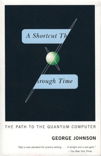
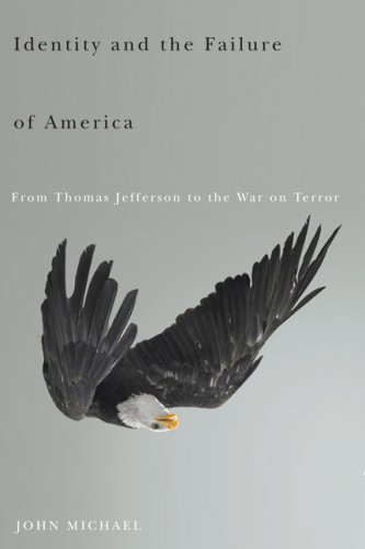
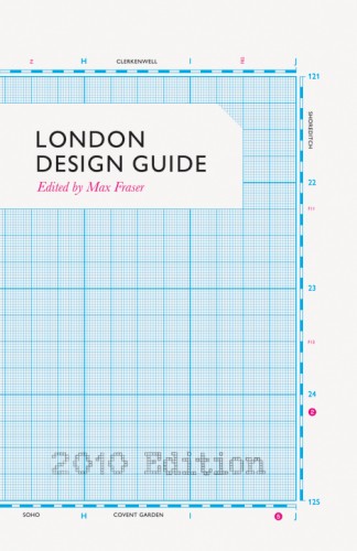
         Mrs eaves has had commercial success and is a popular typeface. It is most commonly used on book covers and spines. It can be seen on Penguin Classics from Penguin Books. Mrs eaves can also be seen on album covers like Blacktree Quicksilver and Radiohead’s 2003 album Hail to the Thief. NBC even used is on their show “For Love or Money.”


Type Classification

Every typeface has a different classification, describing their qualities and characteristics. The different types of classifications are:
 Old Style (also call Gerald), Transitional, Modern (also called Didone), Square Serif (also called Slab Serif or Egyptian), Sans Serif: Geometric, Sans Serif: Humanist, Sans Serif: Grotesque or Grotesk.

Old Style:
-Based on handwriting
-Considered to be a warm and friendly classification of type
-Characteristic of old style is low contrast and cove bracket

Transitional:
-Refinement of Old Style
-More contrast in thick to thin
-Bracketed serifs

Modern:
-Extreme contrast between thick and thin
-Mathematically constructed
-Flat unbracketed serifs

Square Serif:
- Uses only one weight
- Has square ended serifs
-Was used for bold display font (used at large sizes)

Sans Serif (Geometric):

-Influenced by Bauhaus movement
-Uses geometric shapes
-Litter variation in line thickness


Sans Serif (Humanist):
-Uses oval shapes
- Variations in stroke thickness is used to create a more graceful and human appearance.

Sans Serif (Grotesque):
- Helvetica is one of the world's most popular Grotesque font
- Its uniform, upright character
- Referred to as "anonymous sans serif"


Sunday, September 9, 2012

Huckleberry Finn Inspired Music

For this post, I'll be posting music that makes me think of the story "Huckleberry Finn," or is "Huckleberry Finn esque to help me better create compostions for the well known story.

http://www.youtube.com/watch?v=QHfogiHo1zM

http://www.youtube.com/watch?v=1qDqklBDmxE

http://www.youtube.com/watch?v=0omJqpx7Iic&feature=relmfu

http://www.youtube.com/watch?v=sHwPX_N7yxA
(this song actually has lyrics, but without this version, has no lyrics, and is Huck Finn esque)

http://www.youtube.com/watch?v=AVUADDz3JLU

Enjoy!! :)

Didot and Baskerville In Use


For this blog, I am finding examples of the fonts, Didot and Baskersville. Which I am using in the project I am working on.


This cover used baskerville well because of how the how the type is balanced in the center. 


 This cover uses Baskerville well because of the use of negative space and asymmetry.


This cover only uses a small amount of a Baskerville, but overall the use of type is really good. The type is off-centered and the variation of type isn't distracting, or takes away from the cover.


 This cover uses Baskervill is a simple and bold way. Your eye immediately goes to the biggest thing, and then moves down the cover. The text is bottom heavy which is good, and the contrast of the dark green and white is effective.


This cover uses the type really well. The type interacts with the images, and blocks of color leads you eye around the cover. Even though most of the text is centered, its still a very successful cover


This cover uses type in a good way because of the asymmetry of the larger type on the left side. The contrast of size and color also adds to the success of the layout.


 This cover is simple and but effective. Its not all about the text.


This cover is all about the text. Your attention ges straight to the big Y in the corner, but then your eye goes to the title. Its simple but bold.

I really like this cover because the white type is subtle but contrasting with the red background. The asymmetry in addition to having the type and the image sort of balance each other out make this a good cover.

This cover is successful because of a few things. It has good contrast with color and size. The white text pops off the page and the pink is a nice touch.