For this blog, I am finding examples of the fonts, Didot and Baskersville. Which I am using in the project I am working on.
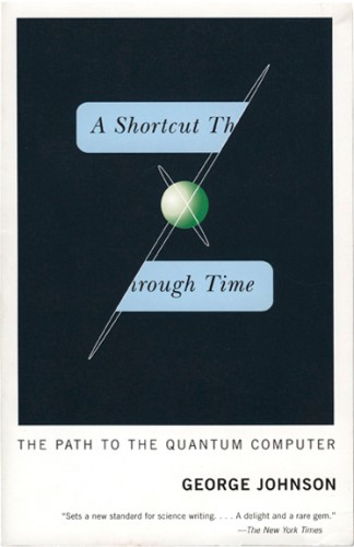
This cover used baskerville well because of how the how the type is balanced in the center.

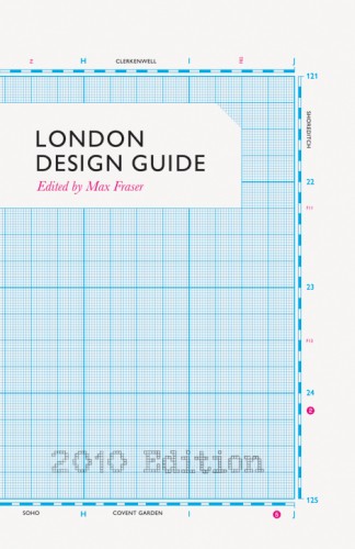
This cover only uses a small amount of a Baskerville, but overall the use of type is really good. The type is off-centered and the variation of type isn't distracting, or takes away from the cover.


This cover uses the type really well. The type interacts with the images, and blocks of color leads you eye around the cover. Even though most of the text is centered, its still a very successful cover

This cover uses type in a good way because of the asymmetry of the larger type on the left side. The contrast of size and color also adds to the success of the layout.


This cover is all about the text. Your attention ges straight to the big Y in the corner, but then your eye goes to the title. Its simple but bold.


No comments:
Post a Comment